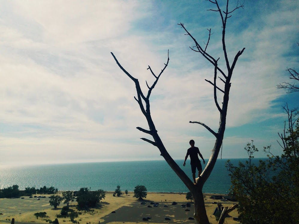
Michigan Lake

Michigan Lake
Photo Credit: Me!

Tuesday, April 15, 2014

Project 9

For Project 9, we were supposed to be creating and editing two different kinds of portraits, one being "fine art" and the other one being a "commercial art" portrait. Once we picked out our best fine art portraits we would edit them and put our best two on our blog. For the commercial art we were supposed to find our five best shots and put them into a collection labeled Commercial Portraits, edit one in Photoshop, make it into a magazine cover and post it on our blog.


In this photo I took a photo of my friend, Sarah Fardanesh. I placed her in front of
a brick wall at Lincoln High School. I snapped this photo in the early afternoon.
The sun was peeking out through the clouds which shinned a light on my model's body.
I brought the picture into Light room and decreased the saturation of the picture and upped
 the exposure. I enjoy this photo because the exposed light brings out the
beauty of my model.


I snapped this picture of my friend,  Morgan Nuss. I placed her in front of a rough
background in the late afternoon in my neighborhood outside. The sun was close to
 setting and casted a dim light on my model.  I brought the image into Light room, upped
the exposure, upped the saturation, and put a minor green tint on the photo. I enjoy
how the photo looks.


This is a photo I took of my sister, Aitana Sandino. The setting for this image was on the leaning tower of Pisa on my vacation over Spring Break. I brought the photo into
 Photoshop where i put a color mask over the photo to bring out the colors and saturate the picture a bit more. I added a few different text boxes onto the magazine cover explaining what will be inside. I then used the brush tool in photo shop and put on little stars around the photo to make the cover a little more noticeable.


Project 9 - Contact Sheet


Tuesday, April 1, 2014

Portrait - PreWork


Fine art portraiture and commercial art magazines are different from each other but in some cases, they can also work for one another. Fine art portraits is photography created in accordance with the vision of the artist as photographer. Commercial art is the art used in advertising and selling. Some photos such as Corey Arnold's photo below could work in a commercial magazine for traveling.

Fine Art Portraits:

Brooke Shaden
This photographic portrait looks very surreal and caught my attention. She had a very
effective pose and a very intelligent choice in color and digital editing. The orange sky
stands out with the grey clouds surrounding it. Her white dress made of paper airplanes
in the middle of an orange field make the model very noticeable.
Corey Arnold
This photo was taken in a very different setting and caught my eye. He is in an orange
outfit in a very cold setting. These contrasts in color leads your eye to the worker. Everything
is very balanced in this photograph and the model used an effective pose to make
it look like his job is very tough.

Commercial Art Magazines:

Freja Beha
This was one of the covers for "Cover Magazine." On this magazine, there is
 a woman covering herself with an article of clothing. I like it because
the pose is illustrating the concept of the magazine title.

Joel Stein
This was one of the covers for "Time Magazine."
On the cover, there is a man holding up a picture of another
 man's face onto his and they conjoin creating one face.
I think this picture works for this magazine stating that after
 time you change.